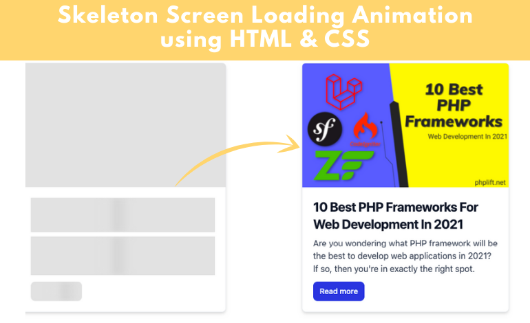
This post explains what Skeleton Screen Loading Animation is constructed using HTML, CSS, and JavaScript. I made this animation for a blog card.
Many websites show Skeleton Loading Animation before loading any part. Certainly, it improves the aesthetics and quality of the site. However, it is essential to know the basics regarding HTML and CSS to create it.
Check out its live demonstration to find out how it functions. I’ve shown this type of effect before, but it wasn’t very effective. In this instance, I’ve employed JavaScript to achieve this effect.
It is a Skeleton Screen Loading Animation running for 3 seconds each time you visit the website. After 3 seconds, the effect will stop, and all information on your post can be visible.
First of all, create a blog posts card here. I have used a tailwindcss blog card and added a post from PHPLift.net. You can do it as per your requirement. It’s very simple and easy to understand.
<div class="blog-card skeleton mt-3">

  <div class="max-w-lg mx-auto">

    <div class=" bg-white shadow-md border border-gray-200 rounded-lg max-w-sm mb-5">

      <div class="blogimage"></div>

      <div class="p-5">

        <a href="https://www.phplift.net/10-best-php-frameworks-for-web-development-in-2021/">

          <h5 class="text-gray-900 font-bold text-2xl tracking-tight mb-2 hide-text">10 Best PHP Frameworks For Web Development In 2021</h5>

        </a>

        <p class="font-normal text-gray-700 mb-3 hide-text">Are you wondering what PHP framework will be the best to develop web applications in 2021? If so, then you're in exactly the right spot.</p>

        <a class="hide-text text-white bg-blue-700 hover:bg-blue-800 focus:ring-4 focus:ring-blue-300 font-medium rounded-lg text-sm px-3 py-2 text-center inline-flex items-center" href="https://www.phplift.net/10-best-php-frameworks-for-web-development-in-2021/">

          Read more

        </a>

     </div>

   </div>

  </div>

</div>
Let’s get a better understanding of skeleton styling as well as loading CSS
I’ve included animation as well as color in the texts and buttons. So the first step was to add color to buttons and text, then I added animations by using @keyframes.
Animation duration: 2s are used to make this animation run for 2 seconds. This animation is the shadow of a black object that will continue from left-right after every two seconds.
The most important step is to disable the animation by using JavaScript. In the above example, we included Skeleton Screen Loading Animation using CSS.
.blog-card .blogimage {

  height: 230px;

  width: 100%;

  position: relative;

  background-image: url(https://www.phplift.net/wp-content/uploads/2021/09/10-Best-PHP-Frameworks-For-Web-Development-In-2021-370x223.png);

  background-position: center;

  background-size: cover;

  border-top-left-radius: 5px;

  border-top-right-radius: 5px;

}


/* now adding skeleton styling */


.blog-card.skeleton .blogimage {

  background: #e2e2e2;

}

.blog-card.skeleton .hide-text {

  background: #e2e2e2;

  color: transparent;

  position: relative;

  overflow: hidden;

}

.blog-card.skeleton .hide-text::before {

  content: "";

  position: absolute;

  left: 0%;

  top: 0;

  height: 100%;

  width: 50px;

  background: linear-gradient(to right, #e2e2e2 25%, #d5d5d5 50%, #e2e2e2 100%);

  animation-name: gradient-animation;

  animation-duration: 2s;

  animation-iteration-count: infinite;

  filter: blur(5px);

}


@keyframes gradient-animation {

  from {

    left: 0%;

  }

  to {

    left: 100%;

  }

}
This animation will go on for a long time. After some time using JavaScript, you need to switch off the animation and tell it to look up all the data within the card. I set the duration to 3000 milliseconds with setTimeout. It means that after 3000 milliseconds, the gray animations will disappear.
<script>

  const $el = document.querySelector(".blog-card");

  // Loading finished

  setTimeout(() => {

    $el.classList.remove("skeleton");

    $el.querySelectorAll(".hide-text").forEach((el) => el.classList.remove("hide-text"));

  }, 3000);

</script>
If you wish to use the 4 second period instead of 3 seconds, you need to choose to use an alternative number of 4000 in this case.
I hope you have learned from this tutorial how to create Skeleton Loading animation using HTML CSS, and JavaScript. Please feel free to comment below if you are facing any issue.


Leave a Reply